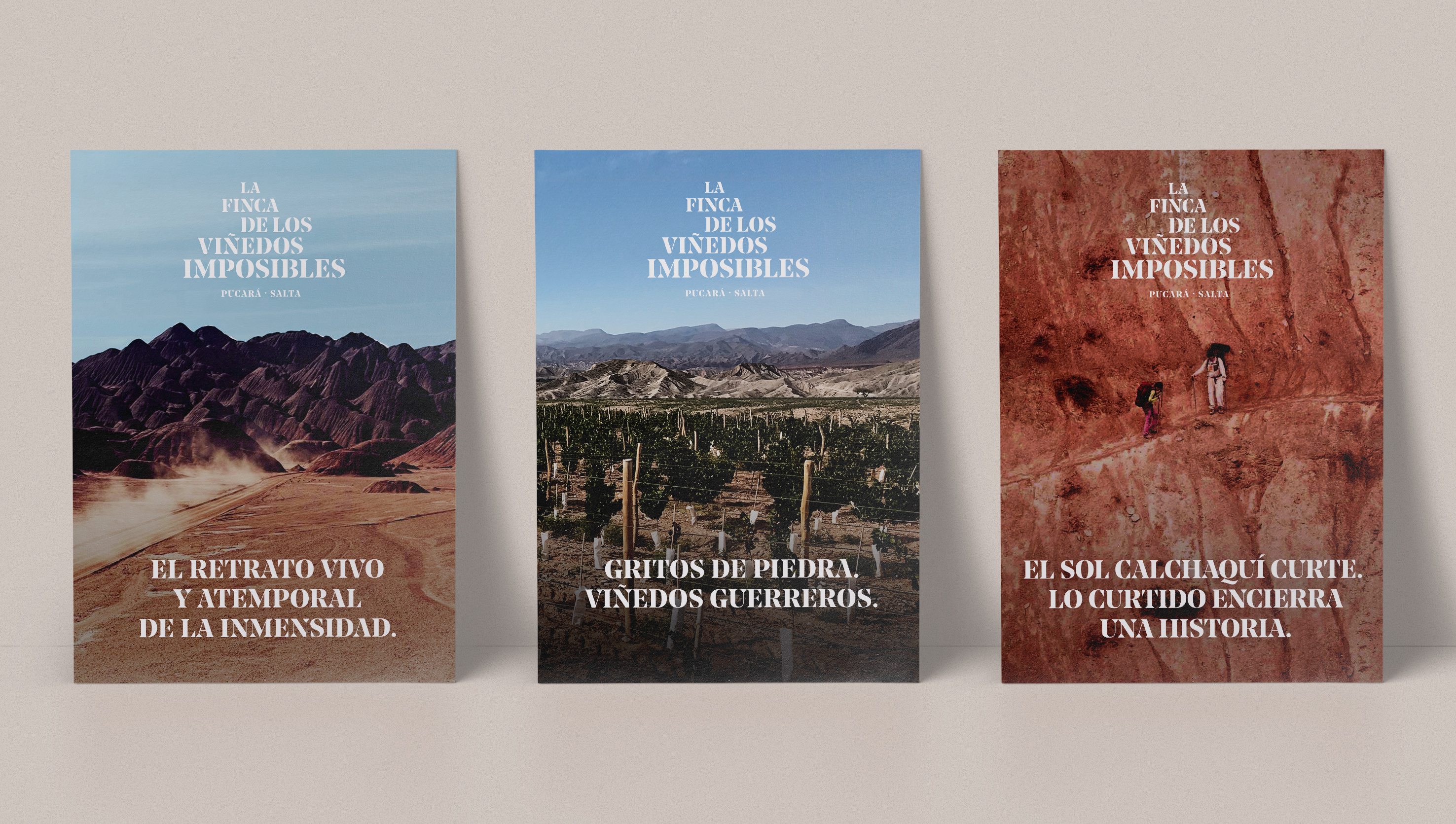
La finca de los viñedos imposibles is a cellar and vineyard from Salta, Argentina located at 2370 meters above sea level.
naming, art direction and brand development
year – 2018 & 2019
location – Buenos Aires, Argentina
@ Shakespear Works
year – 2018 & 2019
location – Buenos Aires, Argentina
@ Shakespear Works

the project
In the lands where the vineyards are located, the climatic conditions are very hostile. The soil is arid and dry and the temperatures are very extreme. The main mission of the winery is, in the extreme climate adversity, to create a wine of excellence.
The name la finca de los viñedos imposibles (the land of impossible vineyards) comes from this premise.
The name la finca de los viñedos imposibles (the land of impossible vineyards) comes from this premise.

the brand
We chose a typeface with firm and precise strokes to evoke vigor and solidity; the serif symbolizes the root, as a metaphor for firmness. Its wide bases suggest poise and brave character and the difference in thickness between the lines, refers to the versatility and adaptability. The difference of sizes between the words that make up the logo, highlights the concept of height which is one of the main characteristics of the winery identity.


the wine
As part of the project and following the brand main concept, we had to think of the name and visual identity of the cellar’s first wine: TENAZ (that persists or lasts a long time without signs of stopping).