Belvo is a spanish start-up aiming to accelerate the development of open finance in Latin America.
design, art direction, brand development, ux and web design
year – 2022 & 2023
location – Barcelona, Spain
@ Belvo
year – 2022 & 2023
location – Barcelona, Spain
@ Belvo
the project
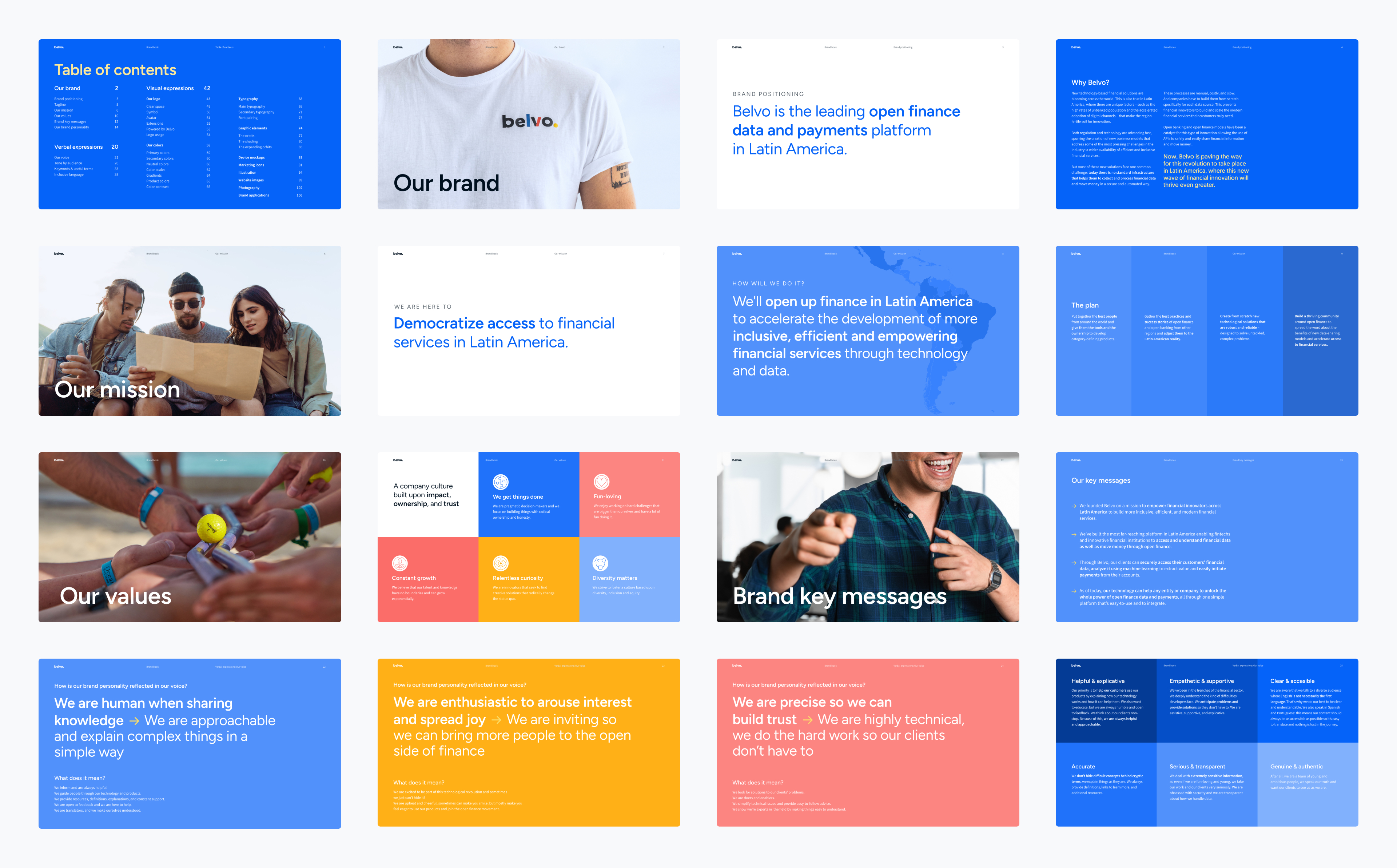
In 2022, Belvo was a 3-year-old company. Up until that point, brand design had primarily been managed by the in-house team, but there was no solid foundation or comprehensive documentation to guide its ongoing evolution. The goal of this initiative was to elevate the brand and adapt it to better resonate with a more enterprise-focused audience. To achieve this, we worked on both the company brand book and the homepage redesign, ensuring consistency across all touchpoints and providing a unified, professional brand presence.
the brand book
This challenge consisted of several phases, including:
- Planning and defining the project’s goals and scope
- Conducting a thorough audit of all brand assets, including visual and verbal expressions
- Performing market research and interviewing team members from different departments
- Defining the content structure
- Collaborating with the content team to align key brand messages and positioning
- Establishing the brand's personality traits
- Developing design guidelines and crafting a narrative for visual expressions
- Overseeing the editorial design of the entire document

the brand
Belvo is human, approachable and simple.
Belvo is enthusiastic, inviting and joyful.
Belvo is precise, trustworthy and highly technical
In our visuals, we want to showcase the Open Finance world using a simple analogy: think of Belvo as a galaxy. Imagine a bright blue scene where data moves like a system of planets. Gravitational forces act like cosmic glue, holding everything together—keeping each bit of binary data in its place. Picture this galaxy forming three years ago, and ever since, it's been steadily growing, like a galaxy on the move.

the website
A company's website is its digital heartbeat, offering a window into the soul of its services and solutions. It transcends mere pixels and code; instead, it reflects the essence and soul of the brand.
Belvo’s website had remained at a previous stage of the brand. It portrayed a company whose primary audience were developers and engineeres (from developers, for developers), with a message geared towards technology, its technicalities, and processes.
Now, the company shifts towards enterprise clients and financial institutions, aiming to communicate with an audience that is less technical and more business-oriented. In order to succeed, they needed to rethink the design of their website and reconsider how they represented and positioned their products, which are highly technical and not easily accessible for everyone.
The project encompassed various aspects of overall web design, including fonts, color application, product imagery, UX and UI design. And it impacted several pages, among them the homepage.

the homepage
The main goal of this revamp was to align the content and design with the company’s vision and to showcase the entire product offering, which now includes Open Finance payment solutions in addition to data aggregation and enrichment. I explored the concept of cyclicity to emphasize that all the company's products can contribute to various phases of our clients' product cycles. I reinforced this idea with a parallax animation.

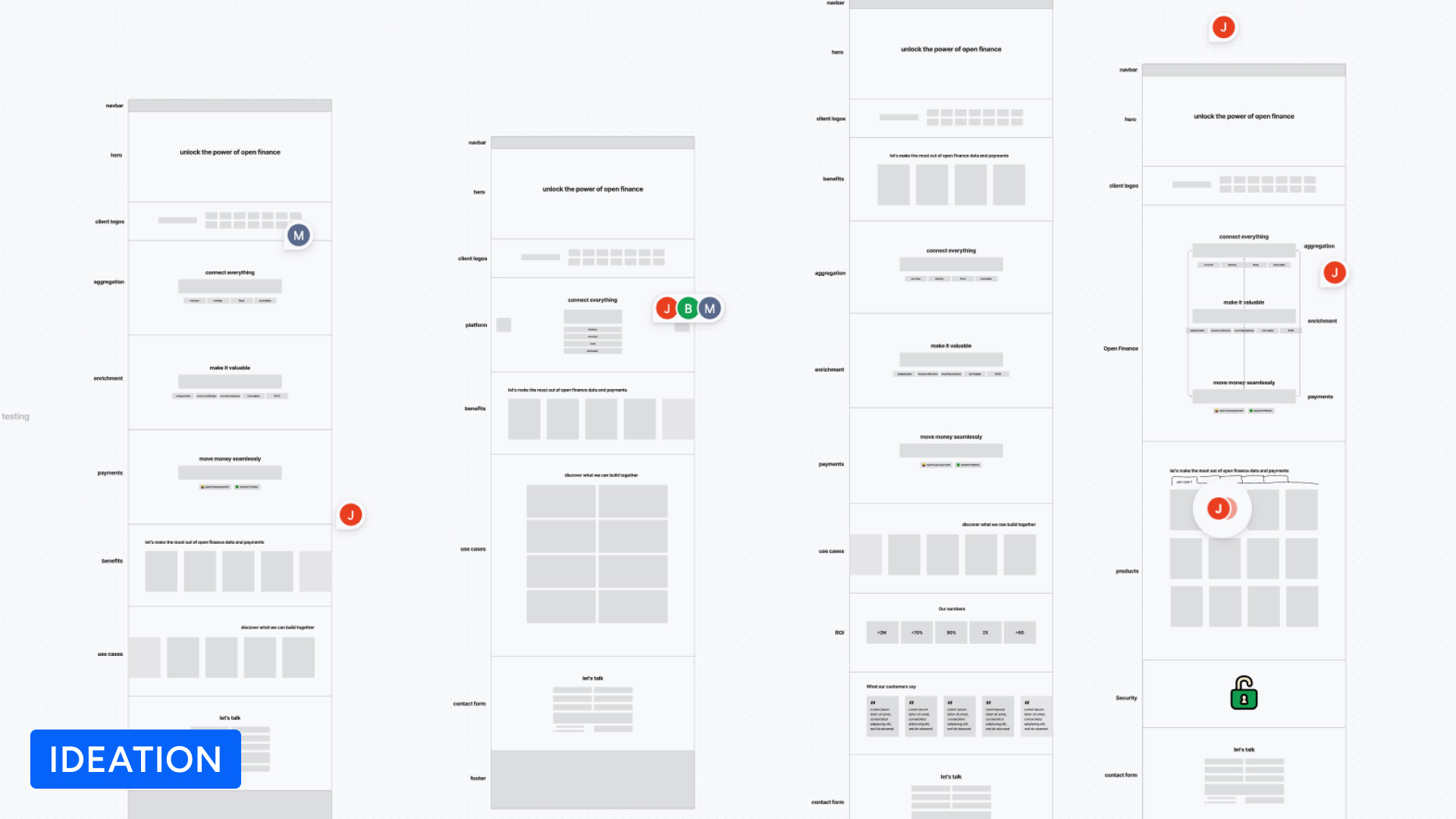


I developed the project from auditing the old homepage, conducting research, brainstorming, structuring content, ideation, gathering feedback from various stakeholders within the company, iterating on the design, handing off to the developer, and performing Q&A.